Case Study
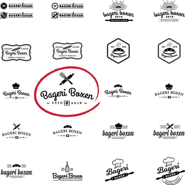
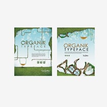
Logo Exploration
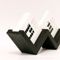
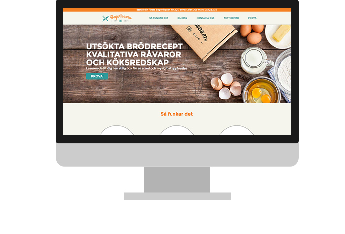
Bageriboxen is a European company based out of Sweden. Translated into English, it means "Bakery Box". They provide fresh, delicious ingredients with different, original recipes to your door step. I researched the branding of several companies that provided similar services and began sketching. Thinking of the multiple uses of this logo (Physical and Digital), I then narrowed my selection to 3 concepts that I thought were strong contenders. After directly working with the client, we finally came to a selection that we're both happy with (pictured above).
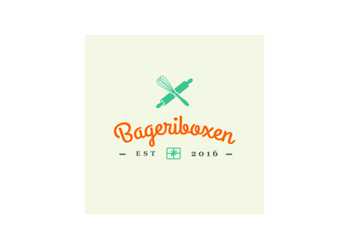
Color
After we selected a concept, the next step was color exploration. After playing with multiple pallets and color swapping, we agreed that orange and teal with a creamy background. I wanted a palette of no more than 2 colors originally, but I ended up adding a beige color because not only did I think it would work as an excellent background color for the website and mobile app, but it could be used to create a soft contrast against a white background for their print pieces.
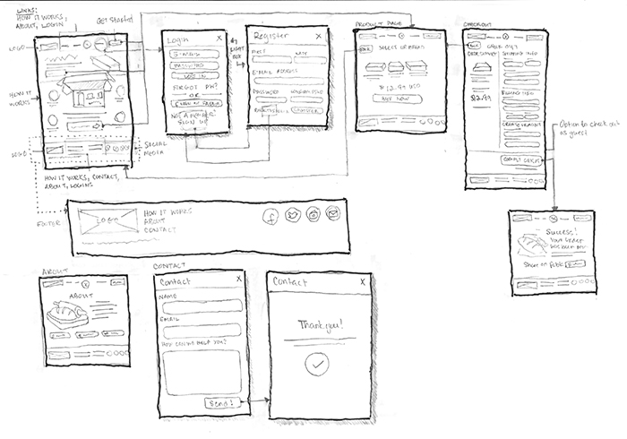
Sketching & User Flow
Diving right back into research, I conducted a competitive analysis on two sites that provided a very similar service that Bageriboxen was aiming for. Previously while I was working on the branding for Bageriboxen, I already had ideas floating in my head about various ways that I could lay out the home and content pages. I worked closely with the client and they did a fantastic job of sharing their needs for the website, so naturally, I had a pretty good idea of how certain elements could be laid out. I thought about things like a pricing table, product display pages, navigation and various other elements that would be incorporated into the design and how i would treat them aesthetically while maintaining easy, simple and fast check-out flow.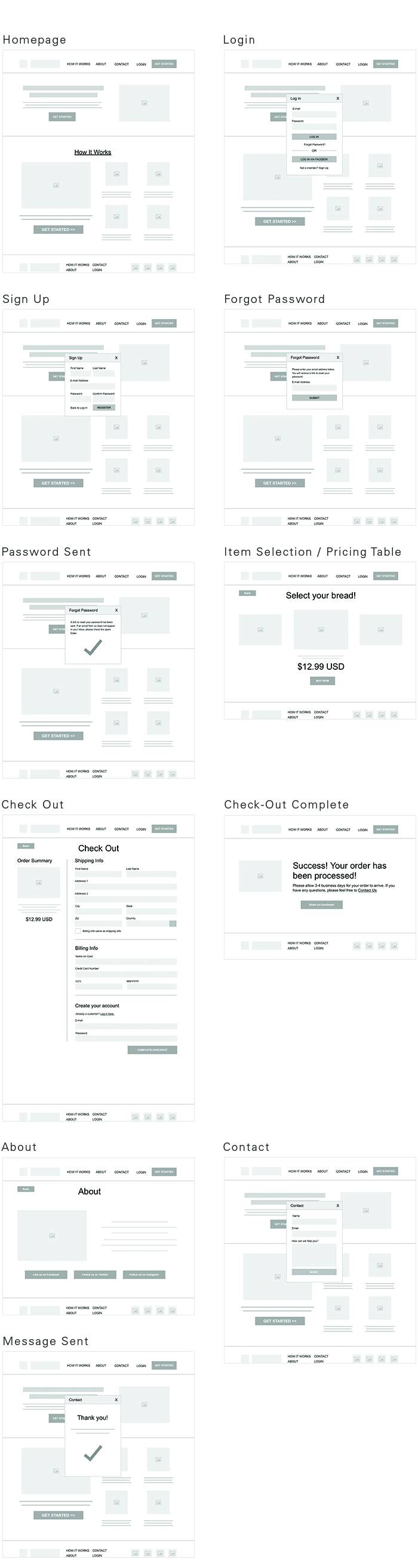
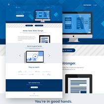
Wireframes
Using my low fidelity sketches as a reference, I hopped into Sketch to create some wireframes to show to the client.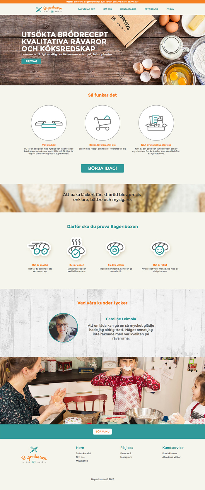
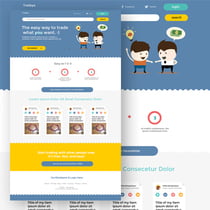
Final Product
After doing a bit of user testing and working together with the client, we decided to add a few changes that we not present in the initial set of wires. First, I decided to add a section that translates in English as "Heres why you should try it". The idea behind this is to express the fact that it's quick, fast, and easy for users who may have doubts about the overall process being a hassle, difficult and time-consuming.
Next, I added a section for Testimonials near the footer because ultimately, the goal is to persuade the user to try this product. What better way to establish credibility by sharing real stories by people who have used this service before. This will help assure and build trust with potential customers who still may not be sure about this product.
I then included a bottom hero graphic that shows a family, bonding using this great product and having a great time with each other in the process. Baking and making bread can be fun, too!
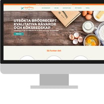
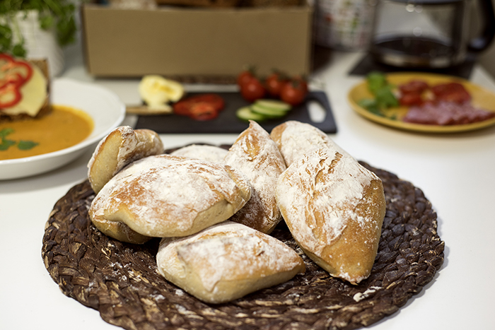
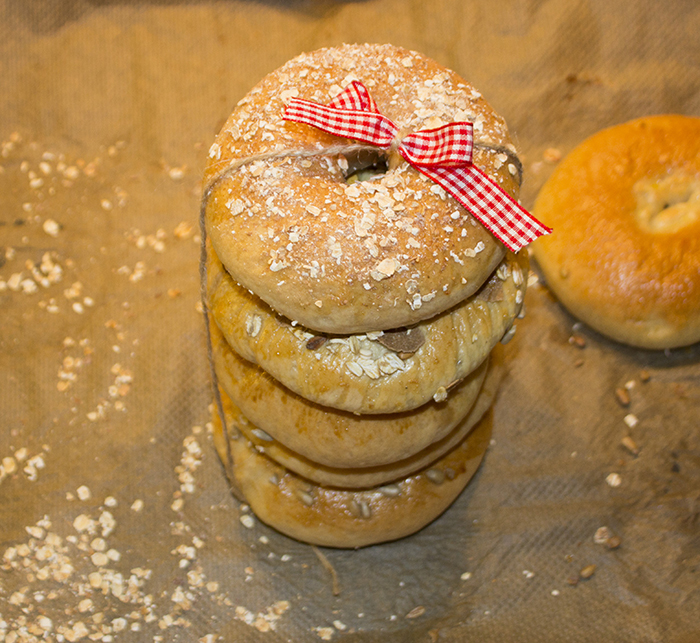
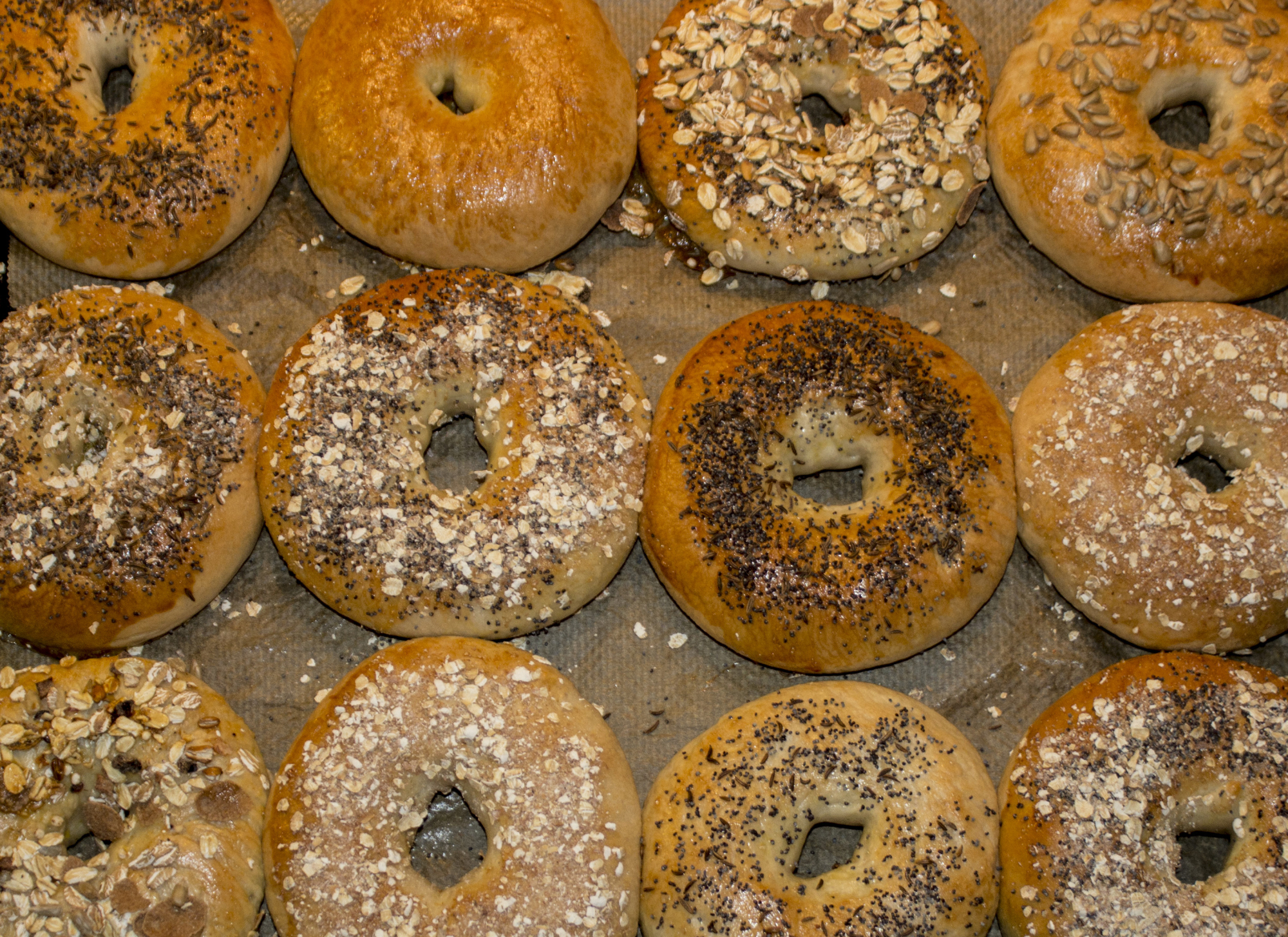
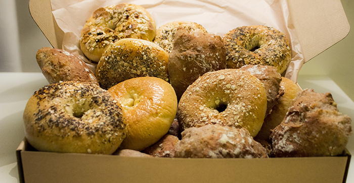
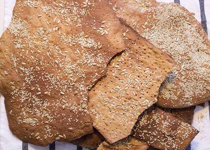
And finally, I added another CTA, "BÖRJA NU", which means "Start Making Delicious Bread" at the bottom right below the hero images of the family to entice the user to take action and start making delicious breads! All in all, my task was to create an responsive website with a brand. I also was responsible for the stationery, package design and the design of the lables and ingredients that are contained within the “bakery boxes”. As for the digital products, I took on the role of sketching, wireframing, prototyping, user testing, and client & user research. The experience with the client was a great! The relationship was very collaborative and It's always great to work with an open-minded client, ping-ponging ideas off of each other to improve a product. The overall project became a success and you can view the final result online at www.bageriboxen.se Please take a look to see the physical product and package design below.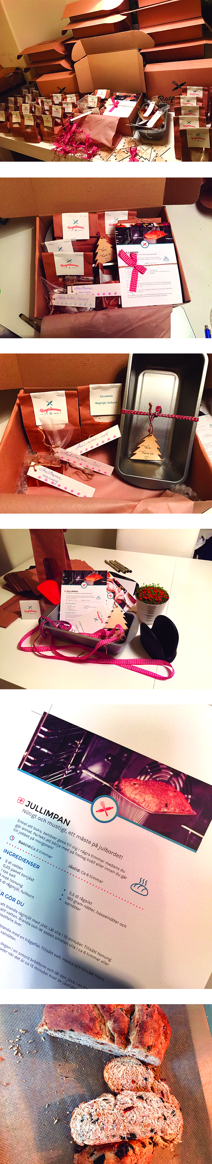
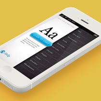
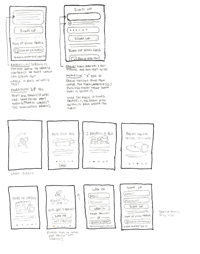
Mobile App Onboarding

Bageriboxen
Bageriboxen is a company based out of Sweden. Translated to English, Bageriboxen means “Bakery Box.” It’s a product that delivers fresh ingredients to your doorstep to make original, delicious breads in your home. My task was to create a brand, apply that brand to various deliverals and responsive website that would allow the user to select and purchase products digitally. I was also responsible for applying that brand to stationery, packaging, recipes and labeling. To make the website possible, I took on the role of sketching, wireframing, prototyping, user testing, and client/user research. Currently, the idea of a mobile app is a work in progress that’s scheduled to happen in the future, but I have also included a sketch of the onboarding process once we reach that bridge. The overall project became a success and you can view the final product online at www.bageriboxen.se